Mr. Bucket Chocolaterie
Designed by JYYJ Associates
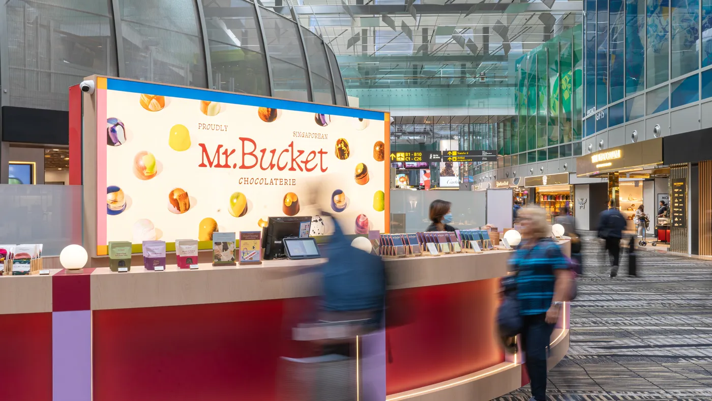
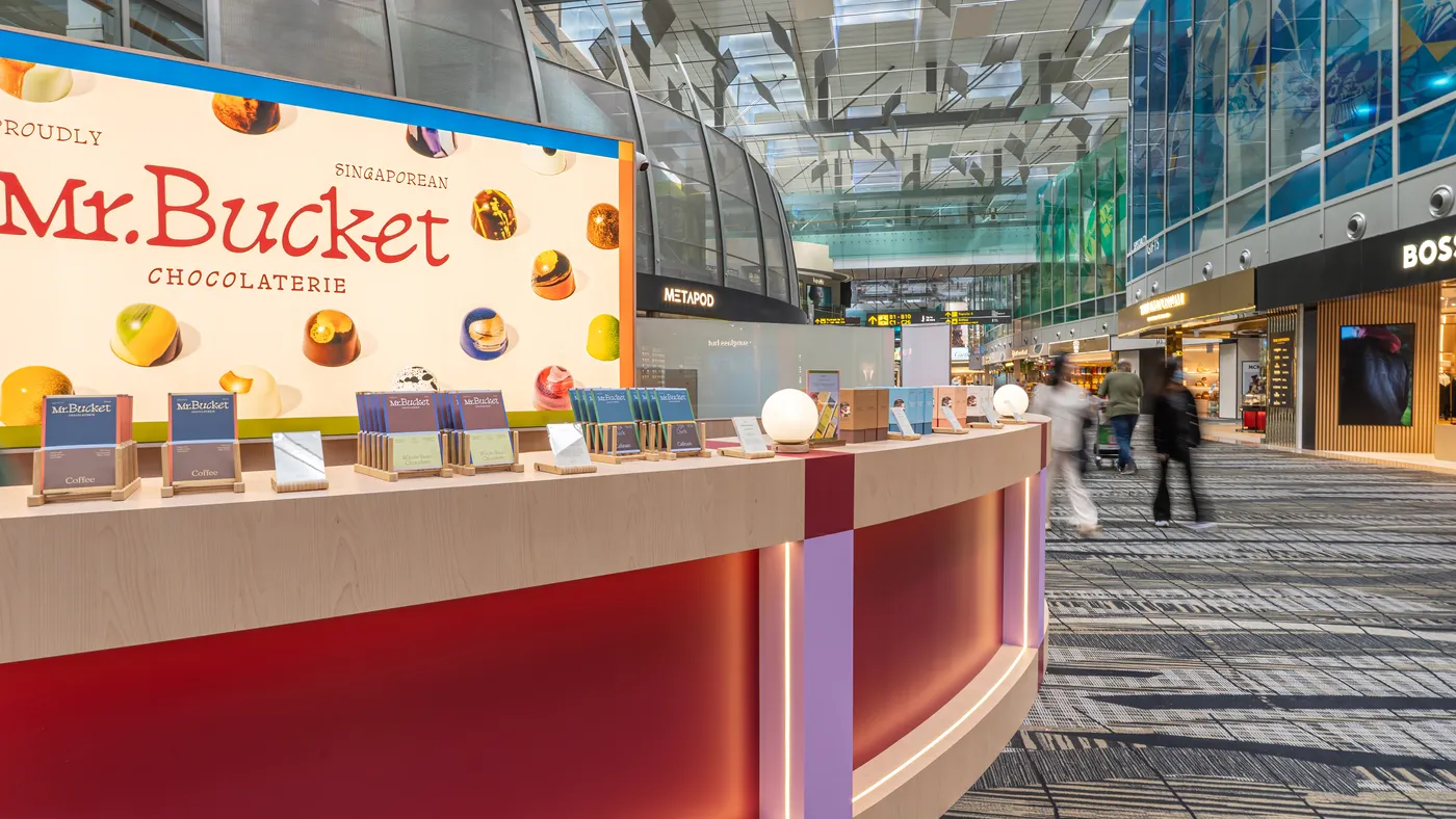
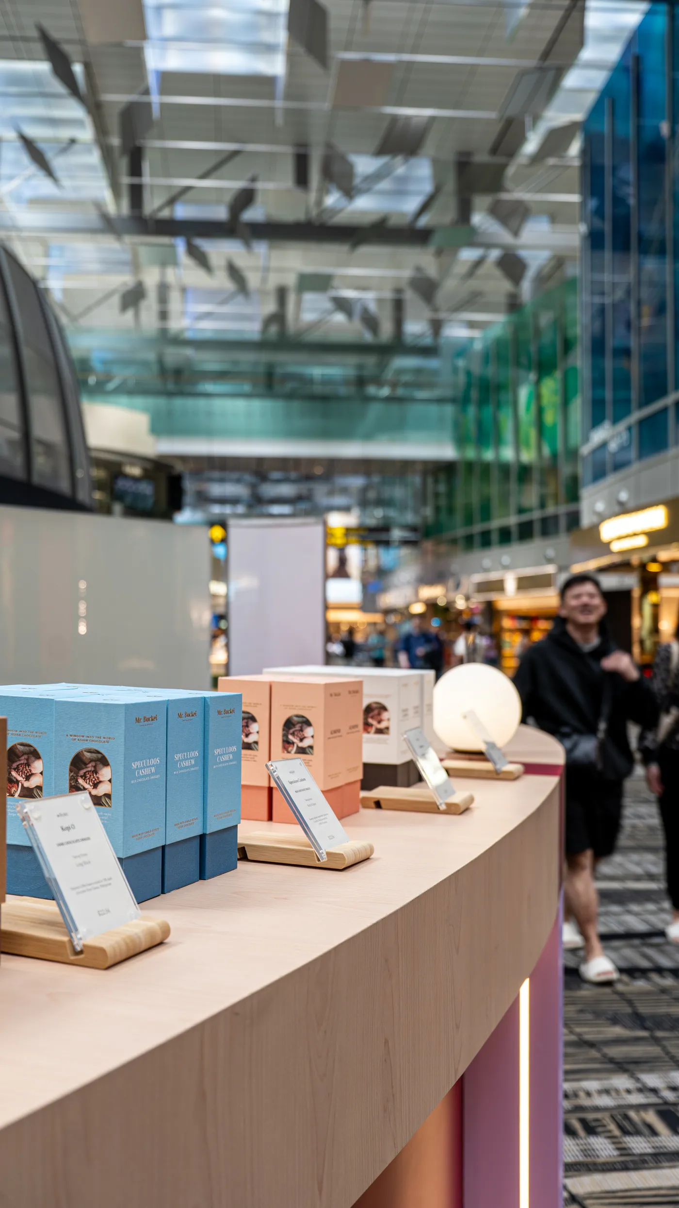
This project — a collaboration with the Singapore Tourism Board — set out to reimagine what a former money exchange kiosk could be, turning an overlooked transit fixture into a genuine retail moment. The client's design guidelines called for vibrant colour, so we used it deliberately: a curved counter wrapped in deep red and lilac panels, with backlit signage scattered with illustrated chocolates announcing the brand from a distance. Different colour zones needed to express the bold, whimsical character of each product line, which shaped how the counter itself was organised — layered lighting effects heighten the visual impact as travellers move around its curve. Because the kiosk sits in one of the busiest transit corridors in the airport, capturing attention quickly mattered as much as the design itself; we tested multiple iterations before settling on the open, low-profile counter that lets high volumes of foot traffic engage with the product without slowing down. Balancing the tourism board's requirements with tight scheduling and cost control throughout, the result is a compact, self-contained expression of the brand that holds its own in one of Changi's highest-traffic zones.